2023
tilig
Tilig is a browser extension password manager designed to make security invisible — giving people frictionless access to their credentials without compromising protection.
Problem
Most password managers feel like a burden. People either avoid them entirely, rely on weak passwords, or abandon the extension mid-flow when it gets in the way. The goal was to design an experience so seamless that using a password manager became the path of least resistance — not a conscious decision.
The password manager for all
Platform
Browser extension
Team
1 PM, 1 EM, 1 Data Analyst and 8 Engineers (4 Android, 4 iOS)
Role
Lead Designer
My Role
I joined Tilig as lead designer to bring clarity and structure to a fast-moving team. Working alongside two agency contractors, I coordinated daily with engineers across iOS, Android, web extension, and desktop, often turning designs around within the same day to keep pace with development. I connected customer insights from the PM into design decisions and was responsible for coherence across all platforms.
Understanding the challenge
Designing a password manager sits at the intersection of two things that don't naturally coexist: security and invisibility. Every friction point we removed was a potential trust signal we were also removing. Every permission prompt, confirmation step, or warning we simplified was something that existed for a reason. The design challenge wasn't just making things easier — it was making things easier without making users feel exposed.
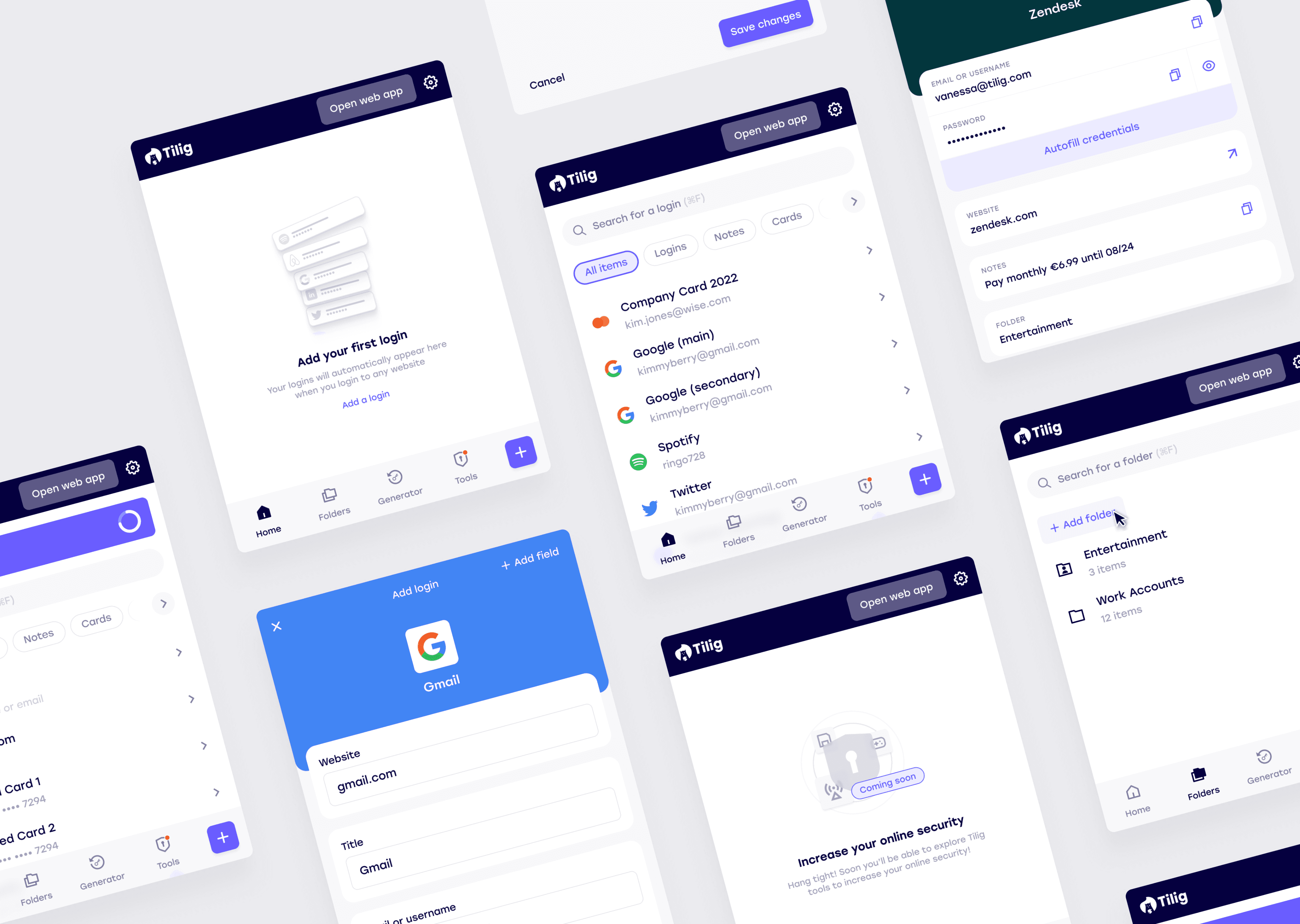
The product also had to work across four distinct surfaces — browser extension, iOS, Android, and web desktop — each with different interaction patterns, constraints, and user expectations. Consistency had to be designed deliberately, not assumed.
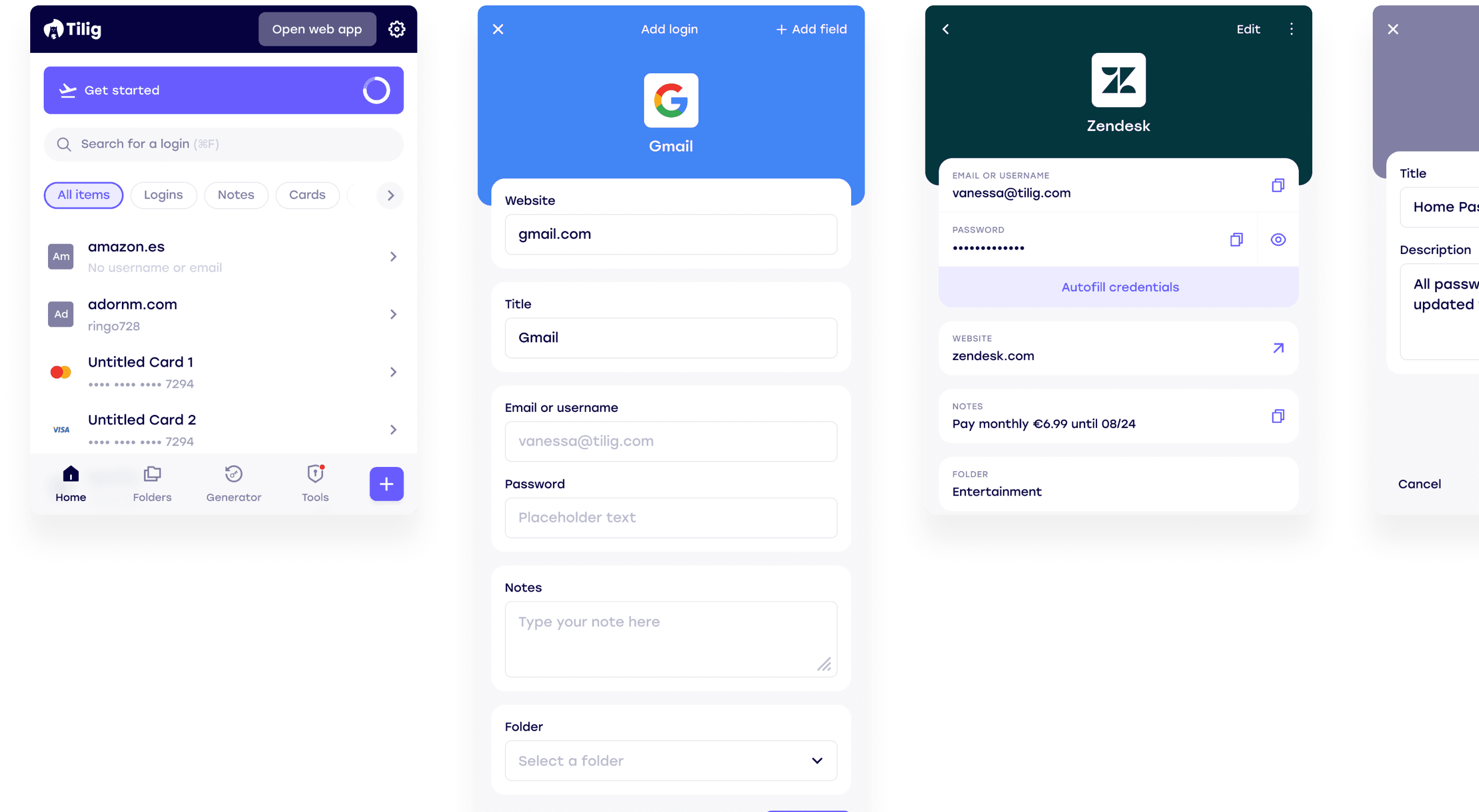
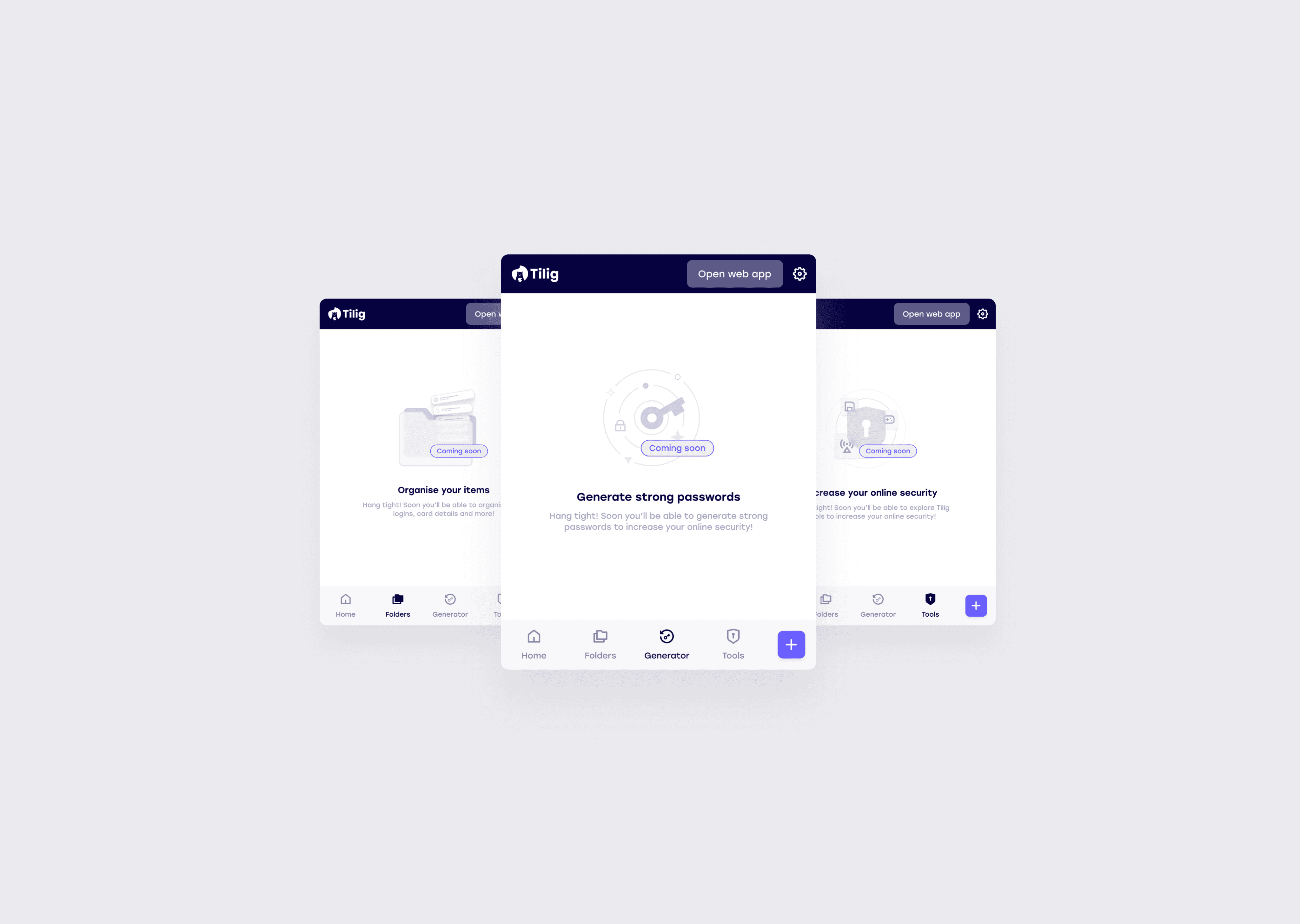
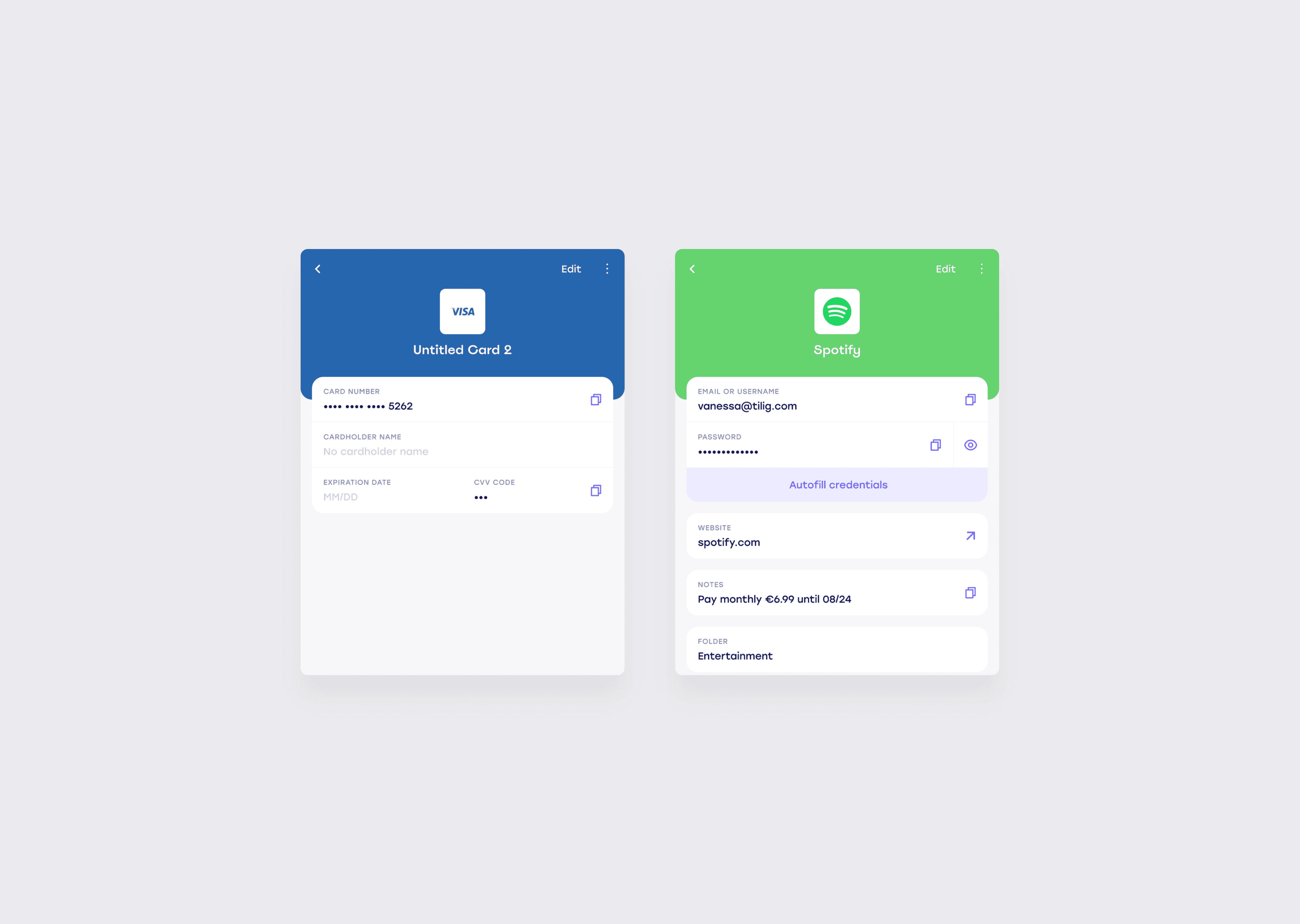
Original extension designs
Tilig browser extension redesign
Design decisions
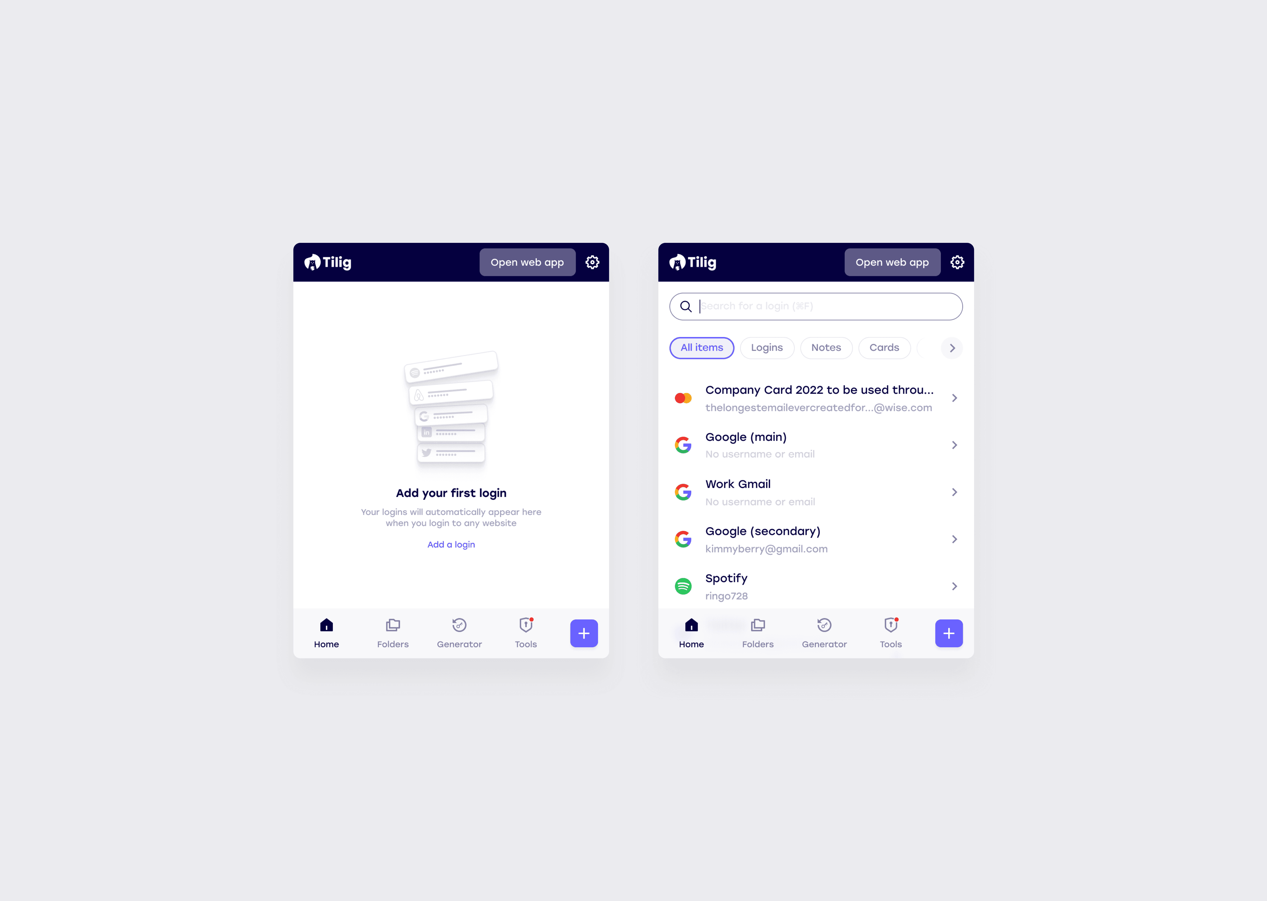
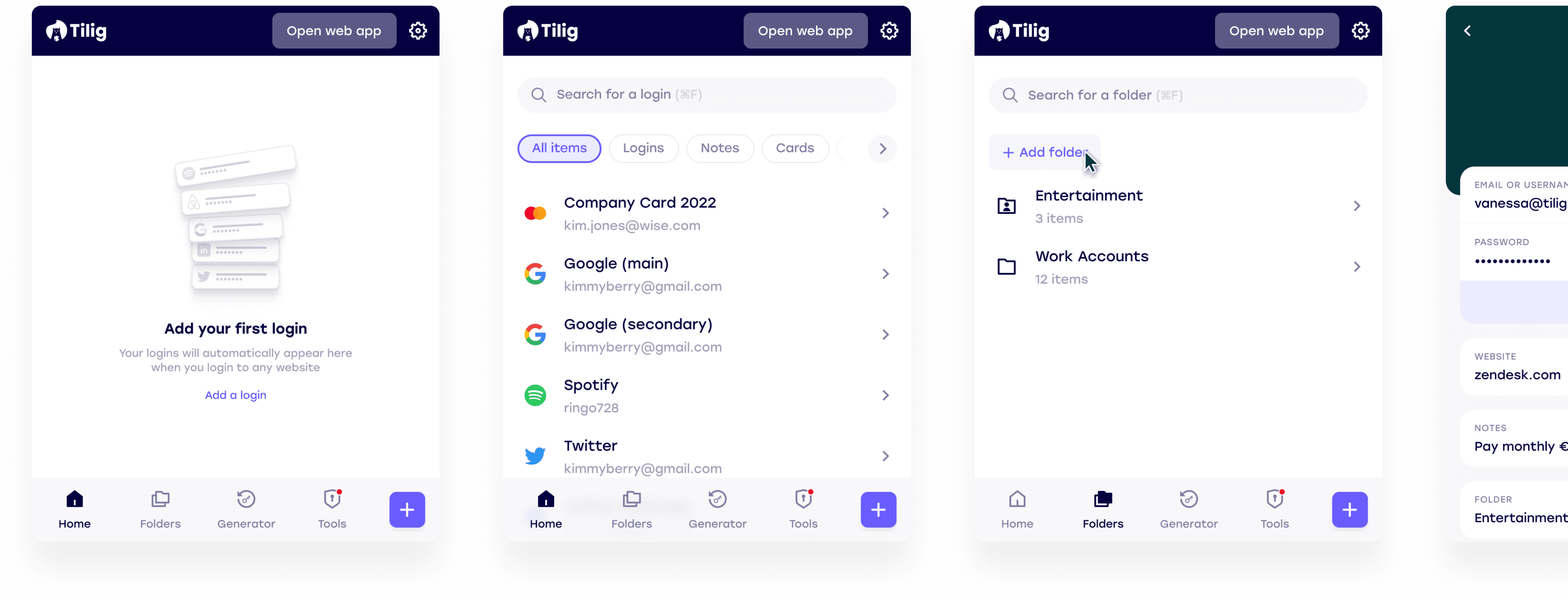
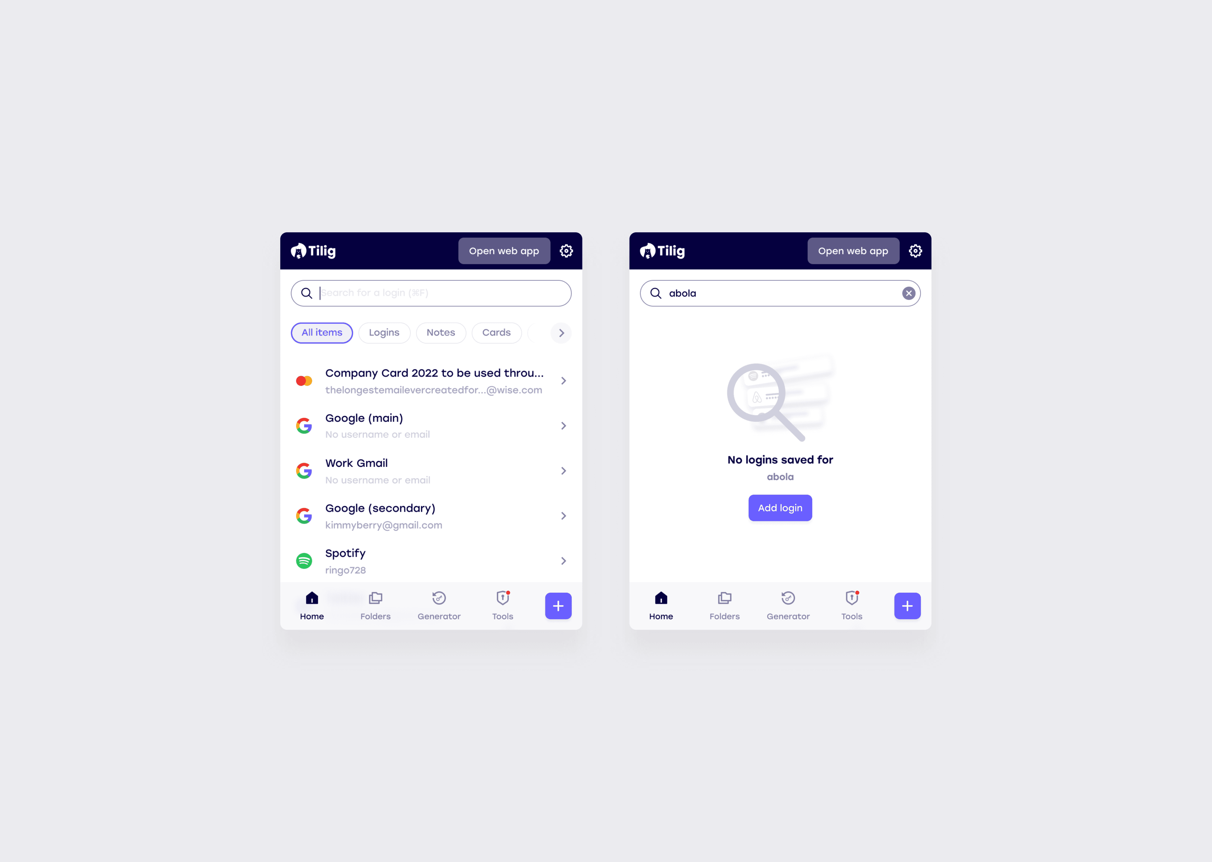
The original Tilig interface used a dark, visually dense UI that carried a technical aesthetic — functional but not approachable. One of the first significant decisions was moving to a lighter, cleaner visual system that felt less like security software and more like a tool people would actually want to open.
That visual shift also had to work within a hard constraint. The browser extension format is a fixed small popup with limited vertical space, one that had to serve a first-time user with no logins and a power user with hundreds. Navigation had to be immediately legible without taking up space the content needed.
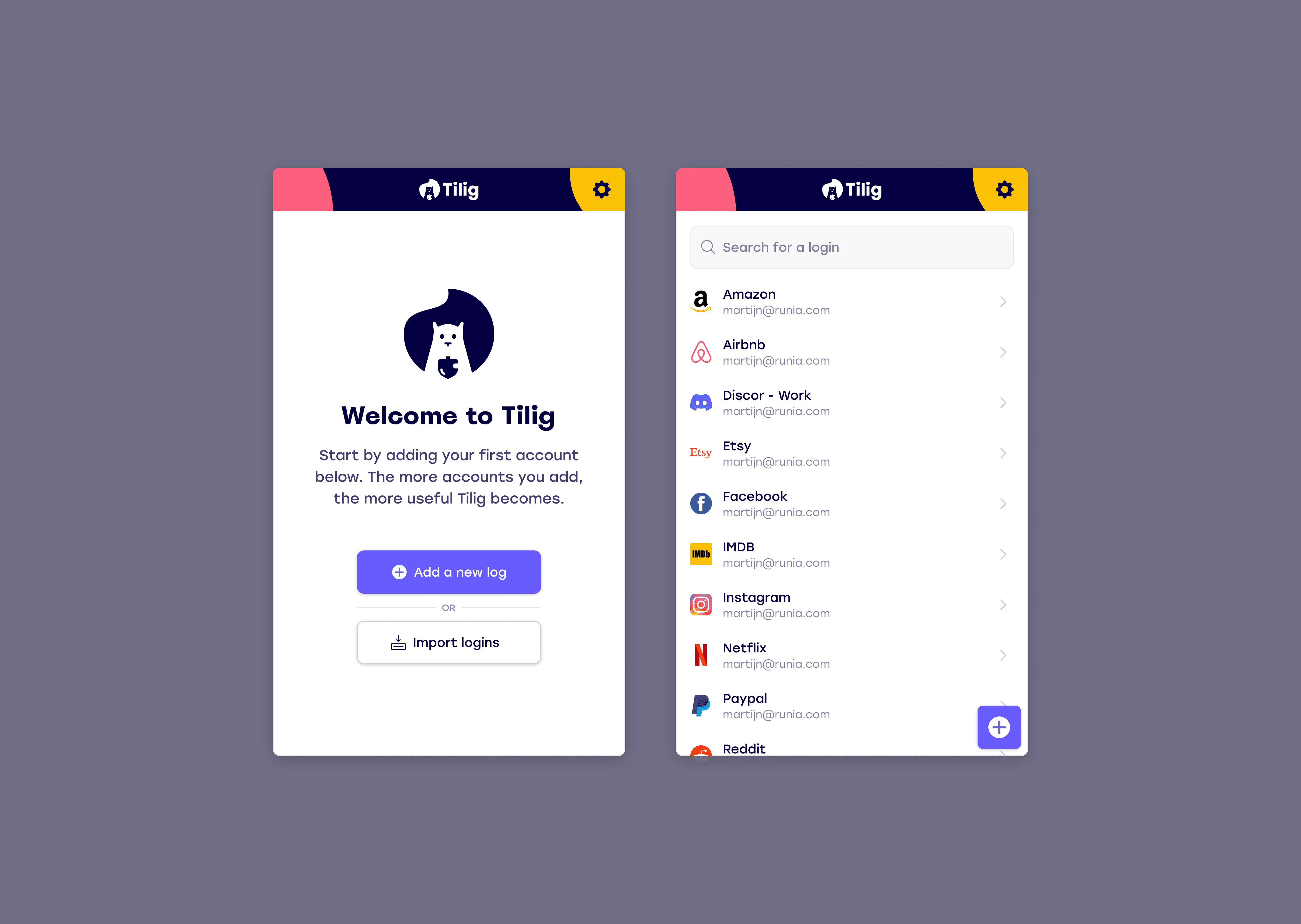
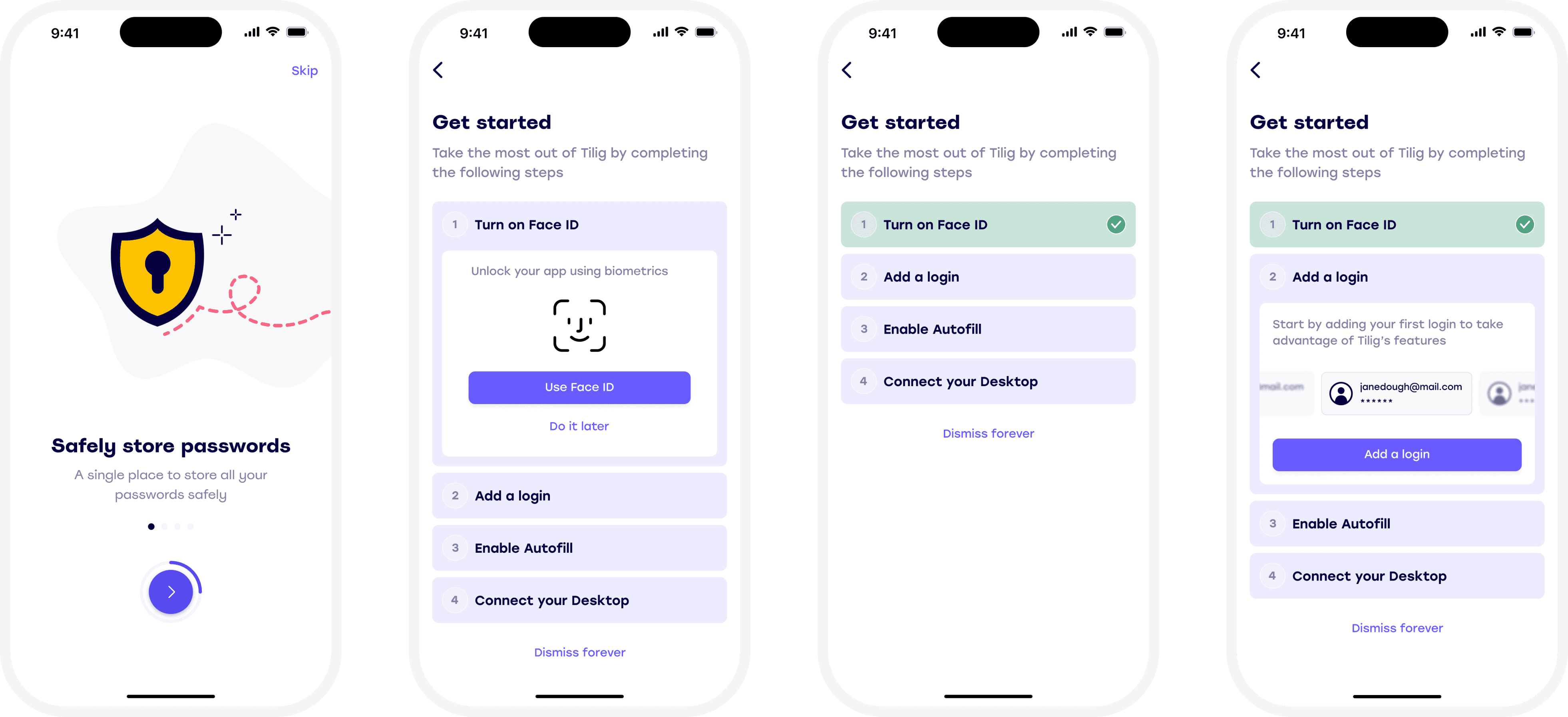
Onboarding
A password manager is only useful if people actually add their credentials, which means onboarding had to do two things simultaneously: build enough trust for someone to hand over their passwords, and make the process feel effortless enough that they actually completed it.
The harder problem was designing for when things didn't go to plan. We designed three distinct paths through getting started: the happy flow where everything worked as expected; the flow where autofill wasn't enabled during setup, which on iOS requires navigating into Settings, a moment with real drop-off risk; and the flow for users who dismissed the process entirely and needed a way back in. Each path had to feel coherent and complete, not like an edge case the product hadn't thought about.
What happened
Tilig was live and being used by customers when the company was forced to shut down after investors withdrew funding. The product never reached the scale we were building towards, but the core experience — particularly the extension flow and cross-platform consistency — had achieved what we set out to do: a password manager that stayed out of the way.